The charts in this chapter share many features with bar and line charts described in Bar and line charts. Data series and groups are entered in the same way into the Aploris data sheet (see Chart data). Formatting, rotating and configuring the chart legend and axes follow the same approach as well.
Using annotation data is also fully supported in these chart types, please refer to Annotation data for more information.
A second value axis cannot be added to the following chart types.
Area charts are comparable to stacked bar charts where stacked elements are not placed next to each other but connected to form a polygon. Due to its nature at least two data groups are required to display a meaningful chart.
By changing the 100% property of the value axis as described in Axis options you can easily switch between an area chart displaying absolute values and a 100% area chart where each group is scaled to 100% of its sum.
Descriptive elements, i.e. growth arrows, delta bridges, delta bars and value (with the exception of element connectors) are supported in an area chart (see Descriptive elements).
Note: If a data series contains both positive and negative values using an area chart usually makes no sense and is not recommended as it may result in an undesired output since areas may overlap in this case.
Marimekko charts are perfect for displaying quantitative data along two dimensions. Consider the following chart where the distribution of the current revenue between regions is clearly visible as well as the share of business segments within each region.
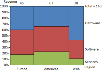
With the value axis configured as 100% axis the area of a rectangular element is proportional to its underlying value. So in the example above we can see that the hardware revenue in Asia is about the same as the services revenue in the Americas.
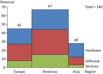
When the same data is inserted as a bar-mekko chart or the 100% property of the value axis is toggled it results in the following chart layout. The distribution between the regions is unchanged as it is determined by the revenue per region. However, the height of the elements is not scaled up to 100% but displayed on a regular value axis just like in a stacked bar chart.
Delta bridges and delta bars can be added to the chart and configured as described in Descriptive elements.
In some cases you may want to specify the shares of the category axis, i.e. the width of the bars in the marimekko/bar-mekko, with custom numbers instead of the sum values. Select Custom widths from the chart’s context menu. When switched on, the second line of the chart data will be used solely to define the width of each bar and is not displayed in the chart. Keep in mind that this affects the proportionality of element areas.
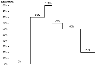
To highlight the top of a bar-mekko select Show ridge line. This line running at the top of the bars in the chart can be configured using the object toolbar.
The following example uses a ridge line to display a utilization curve. To achieve this bars have been hidden by removing labels, fill color and border.
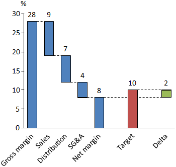
A waterfall chart is typically used to display how summatory numbers build up and how individual components sum up to a resulting figure. See the following chart for a exemplary application of the waterfall chart type. It shows which components are subtracted from a gross margin resulting in an effective net margin which is compared to a target value.
Data is inserted into the data sheet as usual. Aploris will connect the resulting bars in a default way that can be edited later. The inserted waterfall connectors determine how the chart builds up, i.e. the level at which an element is placed is defined by tracking its waterfall connector back to the previous element.
To change any of the waterfall connectors select it to display its anchors. The anchor can now be dragged to another position which will result in a changed layout of the waterfall flow.
A new connector can be inserted by selecting an element which will then display anchors at its corners. The anchors can be dragged to another position to create a new waterfall connector between both points.
Aploris will usually place the leftmost bar directly on the category axis or under the category axis in case all values are negative. Connected bars are positioned according to the waterfall connectors. If you wish to define the position of the logical first bar of the waterfall (which may not be the leftmost) use the commands  Anchor on line and
  Anchor under line from the element context menu. Use the same command again to remove the anchoring.
The combination of selected anchored bars and waterfall connectors may lead to a conflict that is not solvable. Consider for instance two bars with values 2 and 3, both anchored on the category axis and connected with a waterfall connector at their higher ends. You will then see waterfall connectors which do not run horizontally (or vertically for a rotated waterfall chart). In this case revoke bar anchors and/or remove waterfall connectors until a valid waterfall flow is displayed.
To avoid confusion with waterfall connectors, regular element connectors are not supported in waterfall charts.
All other descriptive elements, i.e. delta bridges, delta bars and growth arrows, can be used, see Descriptive elements for details. However, growth arrows often make no sense in typical waterfall charts.