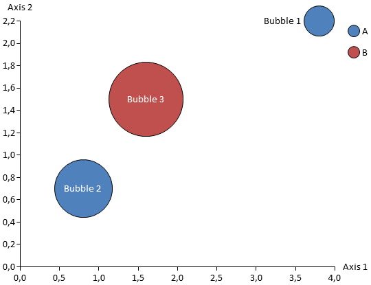
Bubble and scatter charts are both used to display data in a two-dimensional space. Each object corresponds to a line in the data sheet and has two coordinates specifying its position. For bubble charts a third value determines the size of the bubble. An optional parameter that both bubble and scatter chart support can be used to define groups of objects.
Refer to the sample data that is used for a new chart to quickly identify how your chart data needs to be entered into the data sheet.
Axis options like logarithmic scale and grid lines are available for bubble and scatter charts. See Axis options for details.
Among other things groups are used to generate the chart legend and to uniformly color associated objects.
Groups are entered into the data sheet by giving the objects the same value in the “Group” column. If the “Group” value is left empty the object will belong to the same group as the object on the previous line.
Each object supports up to two labels which may be configured to display the object name, the group name, its coordinates and/or – for bubble chart – its size.
Since it may be laborios to find suitable positions for all labels Aploris offers you to come up with a suggestion how to place the labels. Choose Auto place labels to make Aploris determine a suggested position for all labels that have not been adjusted by hand. If you want to update all labels including those that were modified manually select Auto place all labels. To include a single label in the automatic update routine bring up its context menu and select Auto place in case it has been dragged and auto place is not set.
If you are not satisfied with the results of the automatic placement, try to move one or more of the unsatisfactorily positioned labels and trigger the automatic update again using Auto place labels.
The bubble chart adds a third dimension “size”. By default the size of an object is proportional to the area of its bubble. You can choose Diameter scale from the chart context menu to switch to a scale where the diameters are proportional to the size value. In this case an object with size = 2 will have a bubble with twice the diameter and four times (22) the area compared to an object with size = 1. By default the area is twice as big and the diameter ≈ 1.4 ( ).
).
Aploris chooses a scale to display the bubbles in a suitable size. If you like to add a reference bubble choose Show size bubble from the chart context menu. This reference bubble can be placed anywhere on the chart area.
You can use the reference bubble to precisely scale the bubble size in the chart. Use the command Set bubble size to enter the size that corresponds to the reference bubble if you wish to modify the default value calculated by Aploris. Use the familiar resizing feature to specify the size of the reference bubble which will immediately adjust all bubbles in the chart to match its scale.
There may be cases when you have adjusted the bubble sizes manually and want to return to automatic calculation. To do this open the chart’s context menu and select Auto scale bubble size. This option is enabled for new bubble charts by default.
A scatter chart uses symbols to visualize the data points. By default a standard set of symbol formats is applied to the chart data and objects in the same group share a common format.
Lines may be added to bubble and scatter charts to show trends, to indicate partitions or to shade a selected area of the chart.
To add a line select Add custom line from the chart context menu. A horizontal line will be added at the position of the mouse cursor.
You can select the line to display handles at each end. These handles can be dragged to any position within the chart area or on its border. You can also drag the line for a parallel shift. Dragging with Ctrl pressed creates a parallel copy of the line.
The custom line can be formatted using the object toolbar as usual. If a fill color is selected for the line the space on one of its sides is shaded with the given color. You may choose Flip background to move the shade to the other side of the line. If two or more shades overlap you can use Move to front/Move to back to configure the z-order.
A custom line can be converted to a trend line by selecting a group from the object toolbar. The position is then determined by regression over the group data and will be updated whenever the group data changes. Manually moving the line or one of its ends will break the link to the group and results in a fixed custom line.