Labels in Aploris are highly flexible regarding placement and content. All labels have automatically determined default positions where they are placed after creation. You can interactively modify the label placement by dragging the label to another default position or any other custom position. Additionally, all labels can be rotated as described in Editing objects – mouse interaction.
When labels are placed at a custom position their location is determined and stored relative to their default position. This means that a label at a custom position will automatically move whenever its default position changes, for instance a bar sum label will move if the entire chart is dragged to a new position or if the sum changes so its position on the relevant axis moves.
Use an object’s context menu to show a label that is not displayed. The same way a label can be hidden, or simply press Del after selecting one or more labels.
The object toolbar that appears after a selected label is clicked allows changing the format properties of all selected labels.

The basic format properties shown above are available for all labels in Aploris. Clicking any of the buttons or selecting a new value from the drop-down boxes will modify the appearance of the selected label(s) accordingly.
Besides the typical font formatting options Aploris allows to define the paragraph alignment with the rightmost button. By default, the alignment is chosen automatically depending on the type of object and the position of the label.
Likewise, the text color is determined automatically by default. Colors defined by the PowerPoint templates are used and chosen to contrast with the corresponding background. The second button from the right allows changing the default color.
To modify the text format of all labels in a chart, bring up the object toolbar for the main chart area. It will show text format options which will be applied to all existing labels and also serve as template for all newly created labels.
In general, the content of a label is automatically updated based on the underlying data. E.g. a label displaying the sum of a bar is updated whenever the bar sum changes.
Many labels have more than one potential value, for instance a segment in a pie chart may be labelled with its absolute value, the percentage of the entire pie or the name of the corresponding data series. The object toolbar allows you to choose any of the possible values or a combination.

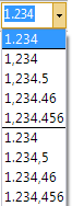
The way numbers are displayed in a label regarding group separators, decimal symbol, signs, pre- and suffixes is governed by its number format. The number format can be selected and edited in the object toolbar. From the drop-down list you can select any of the predefined or recently used number formats. Alternatively, specify a custom number format by entering an arbitrary number in the desired format. For example:
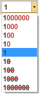
In some scenarios the data supplied for a chart may use dimensions that are not suitable for displaying the values. For instance values like 1,000,000; 55,000,000; 273,000,000 have been entered in the data sheet but you prefer to show labels in millions, i.e. 1; 55; 273. You can now bring up the object toolbar and change the display magnitude for the label. In this case select  to display numbers in millions.
To ensure consistent chart labelling the display magnitude is applied to all numbers that refer to the same scale. E.g. for a bar chart labels all tick marks, bar elements, bar sums, delta bars etc. are using the same magnitude value (in a two axes chart only if they refer to the same axis).
If you wish to add custom text like descriptions or separators to the automatic values double-click any label to bring up the label editor. The editor shows the current content of the label where automatic values are shown as blocks which can only be deleted but not modified. This is due to the fact that these values are updated automatically. New lines can be added to the text with . To confirm the new content and close the editor click on  or press Ctrl + .
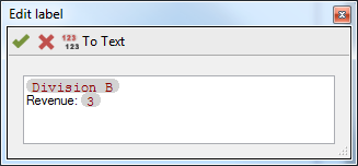
There may be cases when you want to edit the automatic values for instance to insert a line break. If making the changes in the data sheet is not an option you can use the  To text. This command will replace automatic value fields by editable text, thereby removing the link to the data sheet. This means that the text will not be updated to changes made to the underlying data.
Note: To add prefixes or suffixes to a number of labels (like “$M”) it may be easier to edit the number format as described above.
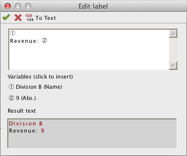
On the Mac the laber editor looks slightly different due to technical limitations. Here variables are displayed as circled numbers in the editable text field. Below the text field you can see the values and names of the currently used variables. Click on any of them to insert it at the cursor position. Since each variable can only be inserted once this will remove the variable at another position if required. The text box at the bottom displays the resulting text with variables shown in red.
Comparable to regular PowerPoint shapes labels can be aligned with each other. Open the context menu for a selection of labels using the right mouse button and select the desired alignment command.
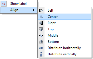
Note: Even after aligning labels they are bound to their default positions meaning changes to the underlying data may cause the labels to use their aligned positions. In this case we recommend entering the final data before completing the chart design.
Aploris has the ability to display placeholders for all hidden labels in a chart. The interactive label placeholders allow displaying selected labels from the range of all available labels. To make use of this feature click on  Label placeholders in the main toolbar. Now an icon will be displayed for each hidden label. Click on any placeholder icon to make the label visible. Clicking on the toolbar icon again will remove the placeholder icons from the chart.
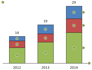
The placeholder icons are only visible in the interactive chart editor and will never appear on your PowerPoint slides.